You have about 3 seconds before a visitor decides whether to stay on your website or hit the back button. That’s not an opinion — it’s what happens the moment your site sends the wrong signal before a single word of your copy gets read.
Most businesses lose leads not because their offer is weak, but because their website quietly tells visitors “don’t trust me” before they get the chance to say otherwise. A visitor doesn’t consciously think “this site has a 4-second load time, so I’ll leave.” They just feel impatient and click away. They don’t think “there’s no SSL badge, so this feels risky.” They just get a vague sense of unease and close the tab. That’s the danger of red flags — they work below the level of conscious thought, which means you can lose a customer without ever knowing why.
Below are the 12 most common website red flags, why each one costs you money, and exactly how to fix it — whether you’re running the site yourself or handing it to a developer.
1. Slow Load Times
If your homepage takes more than 2-3 seconds to load, most visitors are already gone. Studies on page speed and bounce rate consistently show abandonment climbing sharply past the 3-second mark, and it keeps climbing the longer the page hangs. Speed isn’t just a UX issue either — Google uses Core Web Vitals (Largest Contentful Paint, Interaction to Next Paint, and Cumulative Layout Shift) as a ranking factor, so a slow site loses you both visitors and search visibility at the same time.
The worst part is that most site owners never notice, because their own browser has everything cached. Your visitors don’t have that advantage — they’re loading your site cold, often on a mobile connection.
Fix it:
- Compress and lazy-load images (WebP format, proper sizing before upload — not just CSS resizing)
- Use a caching plugin (WP Rocket, LiteSpeed Cache, or similar)
- Audit and remove unused plugins and render-blocking scripts
- Move to hosting built for WordPress performance, not shared hosting stretched across hundreds of sites
- Test with Google PageSpeed Insights and GTmetrix, not just “it feels fast to me”
2. A Site That Isn’t Mobile-Friendly
Over half of all web traffic is mobile, and for many service businesses it’s closer to 70%. A site that requires pinching, zooming, or horizontal scrolling on a phone reads as outdated and untrustworthy within seconds — and it tells visitors, correctly, that whoever built the site wasn’t thinking about them.
This goes beyond “does it technically fit the screen.” Buttons that are too small to tap accurately, text that requires zooming to read, and forms that break on mobile keyboards are all still mobile red flags even on a site that’s technically “responsive.”
Fix it:
- Test every page on an actual phone, not just your browser’s responsive preview mode
- Make sure tap targets (buttons, links) are large enough for a thumb, not a mouse cursor
- Check that forms use the right mobile keyboard type (numeric for phone numbers, email keyboard for email fields)
- Re-test after every major content or plugin update — mobile-breaking bugs are often introduced silently
3. No Clear Value Proposition Above the Fold
If a visitor can’t tell what you do and who it’s for within 5 seconds of landing on your homepage, they’ll assume you can’t either. This is one of the most common issues on small business sites: a beautiful hero image, a clever tagline, and no clear statement of what the business actually does.
Fix it:
- Your hero section needs one clear sentence answering “what is this, and who is it for” — not a vague tagline
- Follow it with a supporting line that adds specificity (the outcome you deliver, not just the service category)
- Put your primary call-to-action in the same viewport, not below three scrolls of imagery
4. Broken Links and 404 Errors
Nothing kills credibility faster than a dead link, especially on a page a visitor was actively engaging with. It signals a site nobody is maintaining — and by extension, a business nobody is maintaining either. It’s also one of the easiest red flags to accumulate without noticing, since links break silently as pages get renamed, deleted, or migrated.
Fix it:
- Run a broken-link audit quarterly (Screaming Frog, Ahrefs, or Rank Math’s built-in 404 Monitor all work)
- Set up 301 redirects for any page you rename or remove — never let old URLs just 404
- Check outbound links too; a link to a source that’s gone dark reflects just as poorly as an internal one
5. Intrusive Pop-Ups and Autoplay Media
A newsletter pop-up before a visitor has read a single sentence, or a video that auto-plays with sound, is one of the fastest ways to trigger an instant exit — and it directly hurts your Core Web Vitals too, since pop-ups are a common cause of layout shift.
Fix it:
- Delay pop-ups until there’s genuine intent signal (scroll depth, time on page, or exit intent)
- Never autoplay audio or video — let the visitor choose to press play
- Make close buttons obvious and easy to tap, especially on mobile
6. Cluttered, Confusing Navigation
If a visitor has to think about where to click next, you’ve already lost momentum. A menu with a dozen items, unclear labels, or no obvious path to your services page will send people looking for a competitor whose site makes the decision easier.
Fix it:
- Keep your main navigation to 5-7 items with plain, predictable labels — “Services,” “Portfolio,” “Contact” — not clever renamed versions of them
- Make sure your most important page (the one that drives revenue) is one click away from every page on the site
- Use breadcrumbs on deeper pages so visitors always know where they are
7. Missing or Buried Contact Information
If someone has to dig through three pages to find a way to reach you, they’ll assume you don’t want to be reached — or worse, that you’re not a real, reachable business at all.
Fix it:
- Put a phone number, email, or contact form link in your header or footer on every single page, not just a dedicated “Contact” page
- Include a real business address if you have one — even a general city/region builds legitimacy
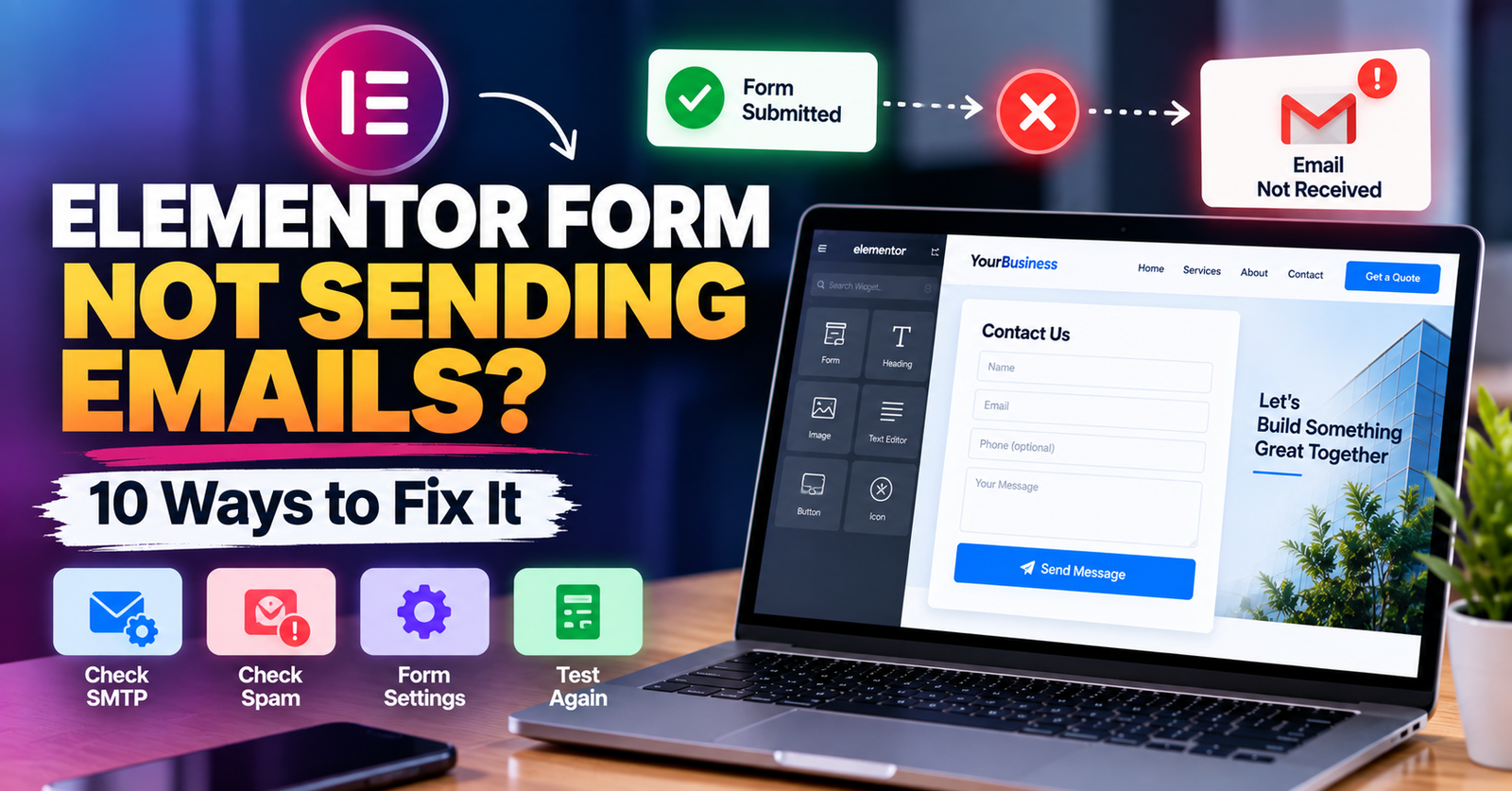
- Make sure your contact form actually sends and that you test it regularly (forms silently breaking is more common than you’d think)
8. No Trust Signals
No testimonials, no case studies, no security badges, no “about” page with a real name and face behind it — an anonymous-feeling site reads as risky, especially for anyone about to hand over payment details or personal information.
Fix it:
- Add real client testimonials, ideally with a name, photo, or company — not generic five-star quotes with no attribution
- Show visible security indicators (SSL padlock, payment provider badges) at any point money or data changes hands
- Build out a genuine About page. Faces and names build trust faster than almost any amount of copywriting
9. Outdated Design
Visitors judge credibility on design within milliseconds, before they’ve read anything. A site that still looks like 2015 — small fonts, dated color schemes, low-quality or overly generic stock images — quietly tells people your business hasn’t kept up either, even if the business itself is thriving.
Fix it:
- A modern, clean layout with strong typography and current design conventions (not necessarily trendy, just current) does more for trust than most copy changes
- Replace generic stock photography with real photos of your work, team, or product wherever possible
- Revisit your design every 2-3 years minimum — “it still works” isn’t the same as “it still looks credible”
10. No Clear Call-to-Action
A visitor who’s interested but doesn’t know what to do next will simply leave. Every page needs an obvious next step — book a call, request a quote, buy now — not three competing buttons, or none at all.
Fix it:
- One primary CTA per page, repeated at logical points (top, middle, end)
- Use a button color that stands out clearly from the rest of your palette
- Make the CTA copy specific (“Get a Free Quote” beats “Submit”)
11. Text Walls With No Visual Hierarchy
A page of unbroken paragraphs, tiny font sizes, or low-contrast text on a busy background asks visitors to work harder than they’re willing to. Most people scan a page before they decide whether to actually read it — if the scan looks exhausting, they leave before reading a word.
Fix it:
- Break content into short paragraphs, subheadings, and bullet points
- Keep body text at a minimum of 16px with strong contrast against the background
- Use whitespace deliberately — a page that “breathes” reads as more professional, not less
12. Inconsistent or Unprofessional Email/Domain
A contact form that replies from a free Gmail address, or a business still using a Yahoo or Hotmail account instead of a matching domain email, is a small detail that undermines everything else on an otherwise polished site.
Fix it:
- Set up branded email addresses (you@yourdomain.com) through your hosting or a service like Google Workspace
- Make sure every automated email (form confirmations, invoices) sends from a branded address, not a default WordPress no-reply
13. No Way to Get a Fast Answer
Modern visitors expect an immediate path to a human, or at least an immediate acknowledgment. A site with nothing but a static contact form and a “we’ll respond within 48 hours” message loses impatient buyers to the first competitor who offers live chat, a booking calendar, or a visible phone number they can call right now.
Fix it:
- Add a simple live chat widget, or at minimum a WhatsApp/Messenger click-to-chat link
- Offer a self-service booking calendar for calls or consultations so visitors don’t have to wait on an email reply
- Set expectations clearly if a delay is unavoidable (“We respond within 1 business hour” beats silence)
How to Audit Your Own Site for These Red Flags
You don’t need expensive tools to catch most of this. Load your site on your phone using mobile data (not WiFi), time how long the homepage takes to feel usable, and try to complete your own primary conversion action — book a call, fill out a form, make a purchase — as if you were a first-time visitor. Most red flags reveal themselves the moment you try to use your own site the way a stranger would.
It also helps to watch someone else do it. Hand your phone to a friend or family member who’s never seen the site, give them a task (“find out how much this costs” or “book a consultation”), and say nothing while they try. Where they hesitate, scroll back and forth, or ask “wait, where do I click?” is exactly where a real customer would quietly leave instead of asking. That single five-minute test usually surfaces more real red flags than a checklist ever will, because it shows you the site the way a stranger actually experiences it — not the way you’ve trained yourself to see it after months of familiarity.
Run this audit quarterly, not just once. Plugins update, content gets added by someone in a hurry, and small regressions creep in over time. A site that passed every check six months ago can quietly develop two or three of these red flags without anyone noticing until traffic or conversions start slipping.
The Bottom Line
None of these fixes require a full redesign — most are targeted, fixable issues you can knock out over a weekend or hand to a developer as a punch list. But left alone, they compound: a slow, cluttered, untrustworthy-feeling site doesn’t just lose the sale today, it trains visitors to bounce off your brand permanently, and it erodes the SEO rankings that were bringing those visitors to you in the first place.
If you’re not sure which of these apply to your own site, I offer WordPress site audits and redesigns that fix exactly this kind of leak before it costs you another lead.