Promote your cannabis products with a highly professional and well-crafted website. These cannabis website designs will help you create a seamless, engaging experience that drives success for your brand. Whether launching a new site or revamping an existing one, these designs will give you the inspiration and headstart you need to succeed.
The cannabis industry, now a multibillion-dollar sector, continues to proliferate due to its many medicinal uses and health benefits. Cannabis is rich in hundreds of chemical compounds that contribute to its powerful effects, making it a valuable product in the pharmaceutical space. With more than half of US states legalizing medical cannabis, it’s clear why this industry is booming.
For new players in the cannabis industry, digital marketing is essential. A well-designed cannabis website is a smart investment, helping you effectively showcase your products and services online. Whether you choose to purchase a pre-designed theme or template or hire a professional designer, there are many great options available at reasonable prices.
Exploring these top cannabis website designs will give you valuable insights and ideas for your own project. Whether you’re just entering the cannabis market or looking to refresh your website, these examples will inspire you. Find the design that suits your brand best, or note the features that catch your eye for your upcoming project.
Best Cannabis Website Design Examples
1. Mary’s Lis
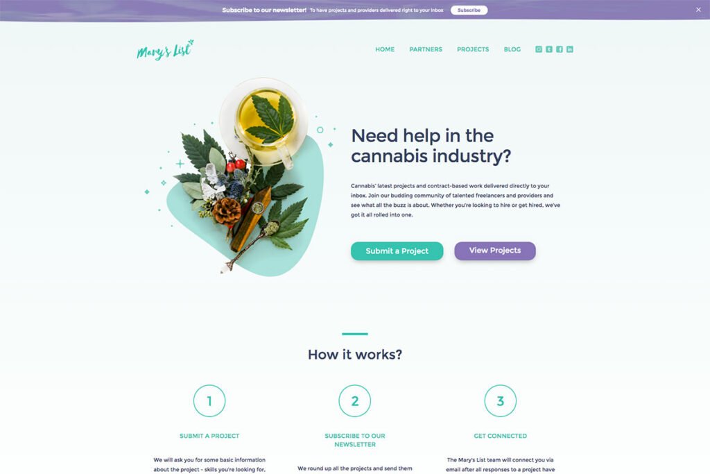
As the cannabis industry continues to expand, having a well-designed website is essential for standing out. Get inspired by these cannabis website designs that will spark creativity for your project. One standout example is Mary’s List, which supports cannabis brands by offering a platform for both ongoing projects and contract-based work.
This website excels with its user-friendly design and engaging content, creating a seamless experience for visitors. The layout is clean and effective, using white space to clearly separate text from visuals, enhancing readability and focus. By following a strong visual hierarchy, the flow of information is organized and easy to navigate.
Notable features of the site include attractive social media icons, a sticky header for easy access to key areas, and an accordion feature for better content organization. These elements come together to make Mary’s List an excellent example of a modern cannabis website.
2. Mowellens
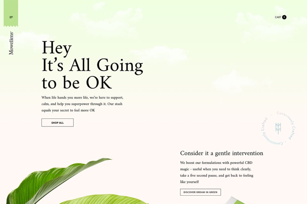
As cannabis increasingly becomes a vital part of medical treatments, many companies are striving to enhance their online presence to stand out in the market. If you want to make your mark but aren’t sure where to begin, these cannabis website designs can provide an excellent head start.
Take Mowellens as an example; it showcases top-quality hemp products while emphasizing exceptional cannabinoid and terpene profiles. The site employs large images and clean typography for a polished look, complemented by GSAP animations for smooth interactions. Additionally, it features a dynamic hero section with a sleek slider to highlight products, creating a modern and engaging experience for visitors. Exploring sites like Mowellens can inspire your own cannabis website design and help you effectively connect with your audience.
3. Curio Wellness
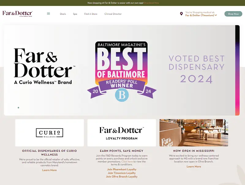
Curio Wellness dispensary features a light and fresh website designed with soft colors that instantly draw customers in. Every element contributes to a relaxing atmosphere, from the imagery and typography to the services offered.
Curio Wellness emphasizes a holistic approach to wellness by not only providing premium cannabis products but also offering massage, acupuncture, skincare services, and educational events.
Navigating the site is incredibly straightforward. The main page provides all the essential information for visiting the dispensary, including location, operating hours, and a list of services. This user-friendly design makes it easy for customers to find what they need and enhances their overall experience.
4. Green Unicorn Farms
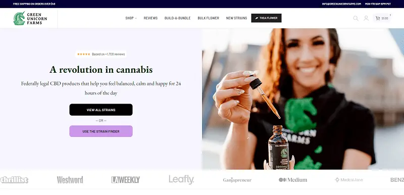
Green Unicorn Farms specializes in smokable hemp flower strains, with a mission to provide customers “the best CBD products possible.” Their tagline, “Feeling is believing,” reflects their commitment to quality.
The website is designed primarily in green and white, with accents of yellow and orange that add warmth. Navigation is intuitive and user-friendly, allowing visitors to easily search through different categories based on their needs.
A standout feature is the personal shopper tool, which simplifies the buying process. After answering a few questions, users receive recommendations for strains or an email with tailored suggestions. Additionally, numerous customer reviews highlight the quality of both the products and the service, painting a positive picture of the brand.
5. Cann
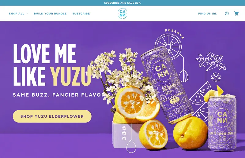
With the therapeutic uses of cannabis, a variety of products have emerged on the market. No matter what cannabis product you offer, establishing an online presence is always worthwhile. One standout example is Cann, a creatively designed cannabis-infused social tonic drink.
The website is expertly crafted to promote the product in an impressive way. The homepage is particularly captivating, featuring smooth GSAP animations that enhance user engagement. The typography is striking, becoming bolder as users scroll down, drawing attention to key information. Additionally, different sections of the homepage are represented in various colors, adding a creative flair while maintaining an elegant overall look. Cann’s website serves as a great inspiration for anyone looking to make an impact in the cannabis industry.
6. Mohasky
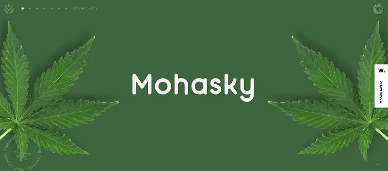
Your cannabis products deserve effective promotion to help people appreciate this therapeutic plant. Mohasky is designed with a clear purpose: it’s a cannabis delivery and education app concept that aims to provide New Zealand with safe and convenient access to medical-grade organic cannabis.
The website excels in both design and functionality, enhanced by subtle animations across various components that add visual interest. The brand uses green as its primary color scheme, reinforcing an eco-friendly perspective for visitors. The hero header prominently features the firm’s name alongside a striking image of the plants and stunning animations, making a powerful first impression. Mohasky’s website is a great example of how to effectively promote cannabis products while emphasizing safety and education.
7. Ontario Cannabis Store
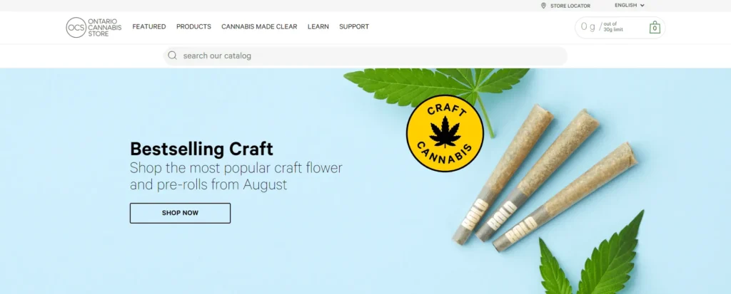
Ontario Cannabis Store (OCS) is the only legal online retailer of recreational cannabis in Ontario, providing safe and responsible access for adults 19 and older. The website is designed to boost credibility with its useful and comprehensive features, making it one of the standout cannabis website designs.
OCS showcases a vibrant and engaging design. The site uses large squares and rectangles to organize different sections neatly, making it easy for customers to navigate and find what they need. The most popular brands are displayed in a clean grid layout, encouraging users to explore the top cannabis products available.
Key features of the site include a sticky header for easy navigation, a robust search feature, and a clear display of payment methods, all of which enhance the user experience and ensure a smooth shopping process.


