If you’ve ever stared at your Google Analytics dashboard, seen a healthy number of visitors, and then wondered why your phone isn’t ringing — you’re not alone. A business website not generating leads is one of the most common (and most misunderstood) problems small business owners face.
Most people assume the fix is more traffic. More SEO. More ads. More social media posts. But here’s the uncomfortable truth I share with almost every client during a website audit: traffic isn’t your problem. Conversion is.
Let me show you what I mean with a real comparison I see constantly in my consulting work.
Two local businesses — let’s call them Business A and Business B — both run electrical services in the same city. Both get roughly 900 website visitors a month, largely from the same Google searches. Business A receives 3-4 enquiries a month. Business B receives 35-40.
Same industry. Same traffic volume. Same competition. Wildly different results.
What’s the difference? It’s never luck. It’s never “Business B just has better customers.” When I dig into these two websites side by side, the pattern is always the same: Business B’s website is built to convert a stranger into a lead. Business A’s website is just… there. It exists. It looks fine. But it doesn’t do any of the psychological or structural work required to turn a visitor into an enquiry.
This article breaks down exactly why that happens — and what separates a website that quietly loses you customers from one that actively generates them.
Your Website Might Look Good—but Still Fail
Here’s something that surprises a lot of business owners: a beautiful website and an effective website are not the same thing.
I’ve reviewed gorgeous websites — clean fonts, professional photography, a modern colour palette — that convert at less than 1%. I’ve also reviewed fairly plain-looking websites that convert at 8-10%. Design polish and conversion rate are only loosely related. What actually drives decisions is psychology, clarity, and trust — design is just the delivery mechanism.
Visitors don’t read your website. Not at first, anyway. They scan it. Research on user behaviour has shown for years that people form an opinion about a website in roughly 0.05 seconds, and that first impression heavily influences whether they stay or leave. In that fraction of a second, a visitor isn’t evaluating your typography choices. They’re subconsciously answering three questions:
- Do I understand what this business does?
- Does this look credible?
- Can I quickly find what I need?
If the answer to any of those is “not really,” most visitors won’t stick around to figure it out. They’ll hit the back button and click on a competitor instead.
This is where a lot of “pretty” websites quietly fail:
- Confusing layouts — visitors don’t know where to look first, so they look nowhere in particular and leave.
- Weak messaging — the homepage talks about the company instead of the visitor’s problem.
- Poor visual hierarchy — everything is the same size and weight, so nothing stands out, including the one thing you actually want them to do.
A website can win design awards and still fail commercially. The businesses that consistently generate leads aren’t necessarily the ones with the biggest design budget — they’re the ones whose websites are built around how real visitors think and behave.
The 10 Biggest Reasons Business Websites Don’t Generate Leads
Below are the issues I find over and over again during website audits. If even three or four of these sound familiar, you’ve likely found the reason your enquiries have stalled.
1. No Clear Value Proposition
Why it hurts conversions: If a visitor lands on your homepage and can’t tell what you do, who you do it for, and why you’re different within about five seconds, they leave. It’s that simple. A value proposition isn’t a slogan — it’s a clear statement of the specific result you deliver.
Example: A homepage headline that says “Welcome to Smith & Co.” tells the visitor nothing. Compare that to “Reliable Commercial Electricians in Manchester — Same-Day Callouts, No Hidden Fees.” One is a name. The other is a reason to stay on the page.
How to fix it: Your homepage should answer three things immediately, above the fold: what you offer, who it’s for, and what makes you the safer choice. No jargon, no vague mission statements — just clarity.
2. Weak Headlines
Why it hurts conversions: Your headline is the single most-read piece of copy on your entire website. If it’s generic (“Quality You Can Trust,” “Your Partner in Success”), it does zero persuasive work. Visitors skim headlines to decide whether to keep reading — a weak one ends the conversation before it starts.
Example: “Trusted Since 1998” tells visitors nothing about the outcome they’ll get. “Get Your Boiler Fixed Today — Fully Licensed, Fixed-Price Quotes” tells them exactly what happens next.
How to fix it: Write headlines around outcomes, not company history. Lead with the result the customer wants, then support it with credibility (experience, licensing, guarantees).
3. Generic Content
Why it hurts conversions: Interchangeable copy — the kind that could describe literally any competitor — fails to build trust or differentiation. Visitors comparing three or four businesses in the same category can’t tell you apart, so they default to price or the first business that feels genuinely credible.
Example: “We provide top-quality services with excellent customer care” could belong to a plumber, a law firm, or a dog groomer. It says nothing.
How to fix it: Replace generic claims with specifics — real numbers, real process details, real outcomes. Instead of “fast service,” say “most jobs completed within 48 hours.” Specificity reads as honesty.
4. Slow Loading Pages
Why it hurts conversions: Page speed is both a UX issue and a psychological one. A slow site subconsciously signals “this business is outdated or careless,” even before the visitor sees a single word of content. It’s also a well-documented conversion killer — the longer a page takes to load, the higher the likelihood a visitor abandons it before it even finishes rendering.
Example: A service business running an unoptimised WordPress theme with dozens of unused plugins and uncompressed images can easily take 6-8 seconds to load on mobile. Most visitors won’t wait past 3.
How to fix it: Compress images, use a caching plugin, remove unused plugins and page builders bloat, and choose quality hosting. A properly built WordPress business website should load in under 2.5 seconds on mobile.
5. Poor Mobile Experience
Why it hurts conversions: The majority of local and service-based business traffic now comes from mobile devices. If buttons are too small, text requires zooming, or forms are painful to fill out on a phone, you lose the visitor at the exact moment they were closest to contacting you.
Example: A contact form designed for desktop that forces mobile users to pinch-zoom just to read the labels will get abandoned almost every time.
How to fix it: Design mobile-first, not mobile-adapted. Test every page, form, and button on an actual phone — not just a browser resize. Tap targets should be large, forms should be short, and phone numbers should be tap-to-call.
6. Too Many Distractions
Why it hurts conversions: Every extra menu item, banner, pop-up, autoplaying video, or unrelated blog widget on a page competes with your call-to-action for attention. When everything is competing for focus, nothing wins — including the enquiry you were hoping for.
Example: A homepage with a rotating image slider, three separate calls-to-action, a newsletter pop-up, and a live chat bubble all firing at once overwhelms the visitor within seconds of arrival.
How to fix it: Every page should have one primary goal and one primary CTA. Remove anything that doesn’t support that goal. Simplicity isn’t boring — it’s clarity, and clarity converts.
7. Weak Calls-to-Action
Why it hurts conversions: A vague or passive CTA (“Learn More,” “Submit”) gives the visitor no reason to act now. Strong CTAs remove ambiguity and friction, telling the visitor exactly what happens when they click.
Example: “Submit” on a contact form is forgettable. “Get Your Free Quote Within 24 Hours” tells the visitor exactly what they’ll receive and how quickly.
How to fix it: Use specific, benefit-driven CTA language. Repeat your primary CTA multiple times down the page — not just once at the very top or bottom.
8. No Trust Signals
Why it hurts conversions: People don’t buy from businesses they don’t trust, especially online, where they can’t shake your hand or see your premises. Without visible proof — reviews, certifications, guarantees, real photos — visitors have no reason to believe your claims over a competitor’s.
Example: A tradesperson’s website with no reviews, no license numbers, and stock photography of generic “workers” (clearly not the actual team) reads as anonymous and unverifiable.
How to fix it: Add Google reviews, client logos, certifications, insurance details, real project photos, and — ideally — real photos of you and your team. Trust signals should appear near every CTA, not buried on a separate “About” page.
9. Difficult Contact Process
Why it hurts conversions: If a visitor has to search for your phone number, scroll through five sections to find a contact form, or fill out ten unnecessary fields, many will simply give up. Friction at the final step is the most expensive kind of friction — you’ve already earned their interest and lost it at the finish line.
Example: A contact form buried at the bottom of a “Contact Us” page (rather than visible throughout the site) with mandatory fields for company size, budget, and timeline discourages casual but genuine enquiries.
How to fix it: Keep contact forms short — name, phone/email, and a brief message is usually enough. Make your phone number and a CTA button visible in the header on every single page.
10. No SEO Traffic from Qualified Visitors
Why it hurts conversions: Not all traffic is equal. A website ranking for broad, irrelevant, or purely informational keywords can rack up visits without generating a single enquiry, because the visitors were never looking to buy. This is one of the most overlooked website conversion optimization issues — the site isn’t failing to convert, it’s attracting the wrong people in the first place.
Example: A plumbing business ranking well for “how to fix a leaky tap yourself” is attracting DIY researchers, not paying customers. It looks like good SEO on paper, but it produces almost no leads.
How to fix it: Prioritise commercial-intent keywords tied to your actual services and location (“emergency plumber [city],” “boiler installation quote”) over broad informational terms, and make sure your content and landing pages match what a ready-to-buy visitor is searching for.
What High-Converting Websites Do Differently
Once you’ve seen enough websites side by side, a clear pattern emerges. High-converting sites aren’t necessarily more expensive or more “designed” — they’re more deliberate. Here’s what they consistently get right.
| High-Converting Websites | Underperforming Websites |
|---|---|
| Clear messaging focused on the visitor’s problem | Messaging focused on the company’s history |
| Leads with benefits, then supports with features | Leads with features and technical specs |
| Strong, specific, repeated CTAs | Vague, one-time CTAs like “Submit” |
| Visible social proof near every decision point | Reviews and testimonials buried or missing |
| Simple 4-6 item navigation | Cluttered menus with 10+ items |
| Loads in under 2.5 seconds | Loads in 5+ seconds |
| Designed mobile-first | Designed for desktop, “adapted” for mobile |
| Content that answers real customer questions | Generic filler content written for search engines only |
| Logical internal linking that guides visitors to convert | Orphaned pages with no clear next step |
| Design choices that reinforce credibility and safety | Stock imagery and generic templates with no real proof |
A few of these are worth expanding on.
Benefits before features. Visitors don’t care that your HVAC system has a “SEER rating of 16.” They care that their energy bill will drop and their house will finally stay cool in summer. Translate every feature into the outcome it produces.
Social proof placed strategically. The most effective websites don’t just have a testimonials page — they place a review, star rating, or trust badge right next to the CTA itself, at the exact moment a visitor is deciding whether to act.
Helpful content that builds authority. Google’s helpful content systems, and increasingly AI answer engines like ChatGPT and Perplexity, favour websites that genuinely answer the questions real customers are asking — not thin pages stuffed with keywords. This is also, not coincidentally, what actually earns trust from human visitors.
Internal linking with intent. On a high-converting lead generation website, every blog post or service page links logically toward a next step — a related service, a case study, or the contact page. Nothing is a dead end.
Simple Website Audit Checklist
You don’t need a full professional audit to spot obvious problems. Grab your website, a stopwatch, and your phone, and work through this in about five minutes.
- [ ] Can you explain what your business does within 5 seconds of landing on the homepage?
- [ ] Does your headline focus on a customer outcome, not just your company name?
- [ ] Does the page load in under 3 seconds on mobile data (not Wi-Fi)?
- [ ] Is your phone number or CTA visible without scrolling, on every page?
- [ ] Does your homepage include at least one visible trust signal (reviews, certifications, guarantees)?
- [ ] Is your contact form 5 fields or fewer?
- [ ] Can you comfortably tap every button and link with a thumb on your phone?
- [ ] Does every page have one clear, obvious next step?
- [ ] Are your images real photos of your business, not generic stock imagery?
- [ ] Would a first-time visitor understand your pricing or process without calling to ask?
If you answered “no” to three or more of these, your website likely has conversion problems that traffic alone won’t solve.
Signs It’s Time for a Website Redesign
Not every underperforming website needs a full rebuild — sometimes targeted fixes are enough. But certain signs point clearly toward a proper website redesign rather than a patch job:
- Your website is more than 4 years old. Design standards, page speed expectations, and mobile behaviour have shifted significantly; a site built in 2020 or earlier often feels dated to modern visitors, even if it “still works.”
- It doesn’t work well on mobile. If you’re pinching, zooming, or struggling to tap buttons on your own site, your customers are too.
- It loads slowly, especially on mobile networks — this affects both user experience and search rankings.
- You’re getting traffic but almost no enquiries. This is the clearest signal of a conversion problem, not a marketing problem.
- Your bounce rate is high and time-on-site is low, suggesting visitors leave almost immediately.
- Your branding feels outdated compared to competitors, undermining credibility before a visitor even reads your content.
- It’s difficult or impossible to update yourself, forcing you to rely on a developer for basic text or image changes — a sign the underlying platform is holding your business back.
If two or more of these apply to your small business website, a redesign focused on conversion — not just appearance — is likely to be the highest-leverage investment you can make in your marketing this year.
Frequently Asked Questions
1. Why is my website getting traffic but no leads?
Traffic and conversion are two separate problems. Traffic tells you people are finding your site; conversion tells you whether your site persuades them to act. Weak messaging, poor trust signals, slow load times, or a difficult contact process can all sink conversions even with strong traffic.
2. What is a good website conversion rate for a small business?
It varies by industry, but many local and service-based businesses see conversion rates between 2-5%. High-performing, well-optimised sites in competitive service industries can reach 8-10% or higher.
3. How long should my homepage take to explain what I do?
Ideally, within 5 seconds, using your headline and subheading alone, before a visitor scrolls at all.
4. Does website design really affect SEO?
Yes. Page speed, mobile usability, and user engagement (like bounce rate and time-on-site) are all factors search engines consider, directly or indirectly, when ranking pages.
5. Should I redesign my whole website or just fix a few pages? I
f your core issues are isolated — a weak homepage headline, a clunky contact form — targeted fixes can work. If multiple issues stack up (outdated design, poor mobile experience, slow speed, low conversions), a full redesign is usually more cost-effective long-term than repeated patchwork.
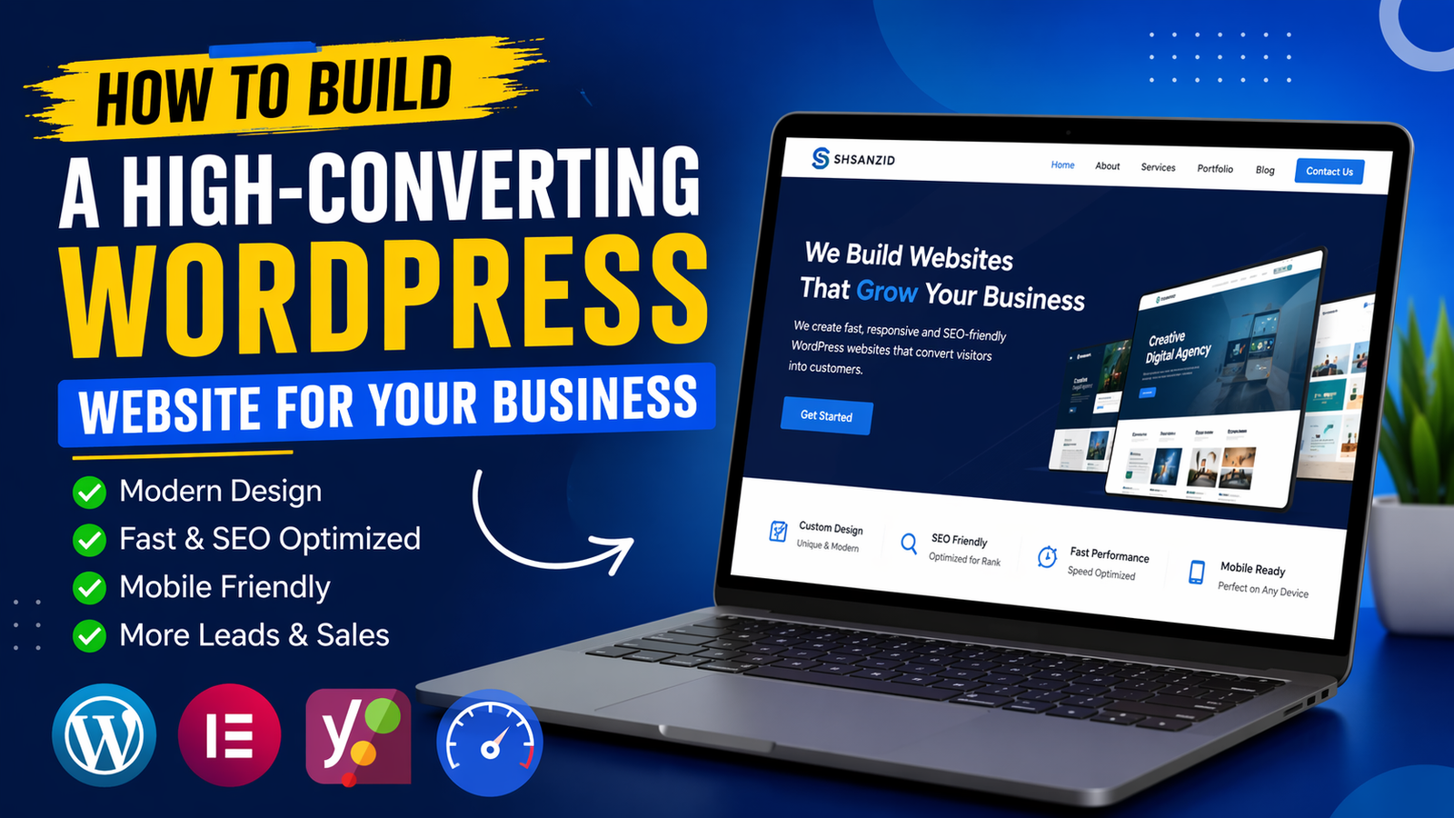
6. Is WordPress a good platform for a business website?
Yes, when built properly. A well-built WordPress business website is flexible, SEO-friendly, and easy to update yourself — but a poorly built one (bloated with unnecessary plugins) can be slow and hard to maintain. The platform matters less than how it’s implemented.
7. How important are testimonials and reviews for conversions?
Very. Social proof is one of the strongest trust signals a website can offer, particularly for service businesses where customers can’t physically inspect the product before buying.
8. What’s the single biggest mistake you see on business websites?
Leading with company information (“About Us,” history, mission statements) instead of leading with the visitor’s problem and how you solve it. Visitors care about themselves first, your business second.
9. How often should a business website be redesigned?
As a general guideline, every 3-5 years, though this depends on how much design standards, your industry, and your business have evolved in that time.
10. Can I improve conversions without a full redesign?
Often, yes — at least initially. Improving headlines, adding trust signals, shortening your contact form, and speeding up page load times can meaningfully lift conversions even before a full rebuild.
Conclusion
If there’s one thing worth taking away from this, it’s that a business website not generating leads is rarely a traffic problem — it’s a trust, clarity, and experience problem. Pretty design, generic messaging, slow load times, and a clunky contact process can quietly undo months of SEO and marketing effort, one lost visitor at a time.
The businesses that consistently win online aren’t necessarily spending more. They’re being more deliberate — about their messaging, their trust signals, their mobile experience, and the path they give visitors from “just browsing” to “ready to contact you.”
Take fifteen minutes this week and run through the audit checklist above on your own site, honestly. You’ll likely spot at least a few of the issues covered in this article.
If you do — and you’d rather not guess at the fixes — a professional website review can pinpoint exactly what’s costing you enquiries and what to prioritise first. Sometimes the gap between a website that’s “just there” and one that consistently generates leads is smaller than you’d think.