Discover why mobile-friendly web design is crucial for modern businesses. Learn how responsive design improves user experience, boosts SEO rankings, and increases conversions across all devices.
1. Introduction
In today’s digital world, your website isn’t just being viewed on desktops — it’s being accessed on smartphones, tablets, and everything in between. With more than half of all web traffic coming from mobile devices, a mobile-friendly design is no longer optional — it’s essential.
Whether you’re running an online store, a local business, or a personal brand, a responsive, mobile-optimized website ensures a seamless experience for every visitor — no matter what device they use. Let’s explore why mobile-friendly web design matters more than ever and how it can directly impact your growth, engagement, and success online.
- Brief overview of the shift in user behavior
- Mention the rise of mobile usage and what it means for websites today
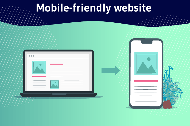
2. What Is Mobile-Friendly Web Design?
Mobile-friendly web design refers to a website layout and structure that automatically adjusts to fit the screen size and device your visitor is using — whether it’s a smartphone, tablet, or desktop computer.
Instead of zooming in and struggling with tiny text or misaligned buttons, users get a smooth, intuitive browsing experience with:
- Readable text without pinching or zooming
- Clickable buttons and links spaced for touch screens
- Fast loading times on mobile networks
- Layouts that adapt fluidly to different screen sizes
In short, mobile-friendly design ensures that your website looks great and functions perfectly — no matter how your audience chooses to visit it.
- Definition of mobile-friendly/responsive design
- Explanation of how it adapts content for all screen sizes
3. Why It Matters in 2025
In 2025, mobile usage isn’t just a trend — it’s the norm. With smartphones becoming even more powerful and accessible, users expect fast, seamless mobile experiences wherever they go. If your website isn’t mobile-friendly, you’re not just behind — you’re losing potential customers.
Here’s why mobile-friendly design matters now more than ever:
- Google Prioritizes Mobile-First Indexing
Search engines rank your site based on its mobile version — not desktop. Poor mobile design = lower rankings. - Users Expect Instant Access
Slow, clunky websites lead to higher bounce rates. A mobile-optimized site keeps visitors engaged and coming back. - Competitive Advantage
A smooth mobile experience sets your brand apart and builds trust with modern consumers. - Higher Conversions on Mobile
Whether it’s booking a service, filling out a form, or making a purchase — users are taking action on mobile more than ever.
In 2025, mobile-friendly design isn’t just good practice — it’s essential to staying relevant, competitive, and connected with your audience.
- Mobile-first indexing by Google
- More than 60% of internet traffic comes from mobile devices
- Impact on SEO, bounce rate, and user engagement
4. Benefits of Mobile-Friendly Web Design
- A mobile-friendly website isn’t just a nice-to-have — it’s a powerful tool that drives real results. Here’s how it benefits your business:
- Better User Experience
Smooth navigation, readable text, and fast loading keep visitors happy — and more likely to stay. - Higher Search Engine Rankings
Google prioritizes mobile-optimized sites in its search results, helping you attract more organic traffic. - Increased Conversions
A seamless mobile experience makes it easier for users to take action — like purchasing, booking, or signing up. - Faster Loading Times
Optimized mobile sites load quickly, reducing bounce rates and improving overall performance. - Stronger Brand Impression
A responsive, modern design shows that your business is professional, up-to-date, and trustworthy. - Wider Audience Reach
Reach users on smartphones, tablets, and other devices — anytime, anywhere. - A mobile-friendly design doesn’t just improve your website — it enhances your entire online presence.
5. What Happens If Your Website Isn’t Mobile-Friendly?
- In today’s mobile-first world, a website that isn’t optimized for smartphones and tablets can do more harm than good. Here’s what you risk:
- High Bounce Rates
Visitors will leave quickly if your site is hard to navigate or slow to load on mobile — meaning lost opportunities. - Lower Google Rankings
Google uses mobile-first indexing. If your mobile experience is poor, your site can drop in search results — hurting visibility. - Frustrated Users
Pinching, zooming, and misaligned content create a frustrating experience that pushes users away. - Decreased Conversions
Users are less likely to buy, book, or contact you if your site doesn’t work well on their device. - Damage to Your Brand Image
An outdated or difficult mobile experience can make your business look unprofessional or out of touch. - In short, if your website isn’t mobile-friendly, you’re not just missing out — you’re actively turning people away.
6. How to Know If Your Website Is Mobile-Friendly
- Not sure if your website is truly mobile-friendly? Here are a few quick ways to find out:
- 1. Use Google’s Mobile-Friendly Test
Head to Google’s Mobile-Friendly Test, enter your website URL, and get instant feedback on how your site performs on mobile. - 2. Check It on Multiple Devices
Open your website on a smartphone and tablet. Is it easy to read? Do buttons work properly? Is navigation smooth? - 3. Resize Your Browser Window
On desktop, shrink your browser window to mimic smaller screen sizes. A mobile-friendly site should automatically adjust and remain usable. - 4. Monitor User Behavior in Analytics
Use tools like Google Analytics to see how mobile users behave on your site. High bounce rates or short sessions could signal mobile issues. - 5. Page Speed Test Tools
Tools like PageSpeed Insights or GTmetrix show how fast your site loads on mobile — a key factor in mobile experience. - If your site doesn’t pass these checks, it might be time for a responsive redesign — and I’m here to help!
7. How I Build Mobile-Optimized Websites
- Mobile optimization is a top priority in every project I take on. Here’s how I ensure your website looks and performs perfectly on every device:
- Responsive Design from the Start
I use responsive frameworks and flexible layouts that automatically adapt to any screen size — from smartphones to desktops. - Mobile-First Approach
I design with mobile users in mind first, ensuring key content, actions, and visuals are prioritized for smaller screens. - Touch-Friendly Navigation
I create clean menus, easy-to-tap buttons, and intuitive layouts that feel natural on touch devices. - Optimized Images & Fast Load Times
I compress and scale images, streamline code, and use modern web practices to ensure your site loads quickly on mobile networks. - Cross-Device Testing
Before launch, I test your site on various screen sizes, devices, and browsers to guarantee a consistent, smooth experience. - SEO & Core Web Vitals
Every mobile site I build is optimized for search engines and meets performance metrics like mobile speed, responsiveness, and stability. - With me, you’re not just getting a good-looking site — you’re getting a mobile-ready platform built to convert and perform.
8. Conclusion + Call to Action
Mobile-friendly web design is no longer optional — it’s essential for staying competitive, visible, and relevant in today’s fast-paced digital world. A responsive, well-optimized website ensures your visitors enjoy a seamless experience, no matter the device they’re using. Whether you’re aiming to boost conversions, improve SEO, or simply modernize your brand, going mobile-first is the smart move.